Building Your Color Story
Color isn’t just a backdrop — it’s a tool for creating spaces that feel alive, personal, and full of story.
Few people understand this better than Daniela Araya, a Hudson, NY–based color consultant and designer who helps clients use color to build homes that feel fearless and deeply individual. Her approach blends color psychology, storytelling, and collaboration to quiet self-judgment and spark confidence. Beyond her client work, Daniela writes about design for publications such as Apartment Therapy and The Interior Collective, and she shares her experiments and insights on her own editorial playground, Statement Wall.
For this edition of Our Guide To, Daniela walks us through how to approach color with confidence. From low-lift exercises to using rugs as a starting point, she offers practical ways to make color work for you — and to create a home that feels as vibrant as the life inside it.
Why is color such a powerful tool in home design?
Color is the secret ingredient that transforms a space from simply being a room into a place where you actually feel something. To me, color is inherently tied to storytelling. We all have different perceptions and tolerances for certain hues, often rooted in our memories. A color might remind you of your childhood kitchen, a vacation, or even a favorite sweater. That’s why I love using color as a tool, because it has the power to transport you to a specific place or time. No matter what shade you choose, it’s going to stir something up emotionally—and that’s pretty magical.
For someone new to color, what's the best way to start?
Begin by experimenting and noticing what you’re naturally drawn to. Once you identify your preferences, you’ll feel more confident bringing color into your home. Decide whether you prefer easing in slowly or going all in. Either way, starting with inspiration and getting familiar with your own color tolerance is key.
Pinterest is great for gathering ideas, but don’t just pin mindlessly—look for patterns. Do the same when flipping through magazines, traveling, or admiring a friend’s home. Ask yourself: Which colors keep reappearing? How do they make you feel? Which shades make you nervous in an exciting way? Is there a place, memory, or story you love that you’d want your home to evoke? Those are all clues.
One of my favorite low-lift exercises is a “color walk.” Before you leave your house, pick a specific color—say, chartreuse—and walk around your neighborhood looking for it. You’ll start spotting it in surprising places: a painted door, a shop sign, someone’s outfit. Snap photos when a combination catches your eye. This not only trains your eye but also helps you see which colors truly light you up.
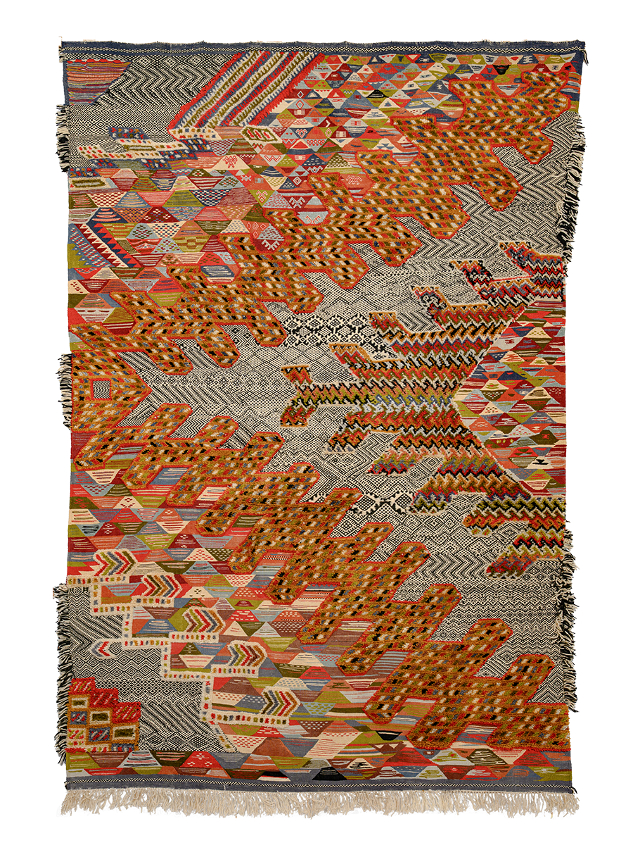
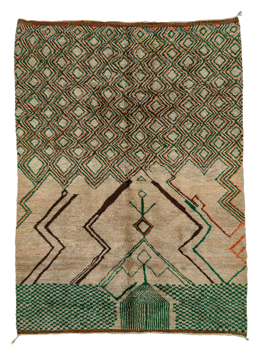
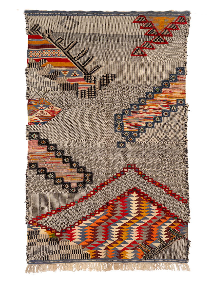
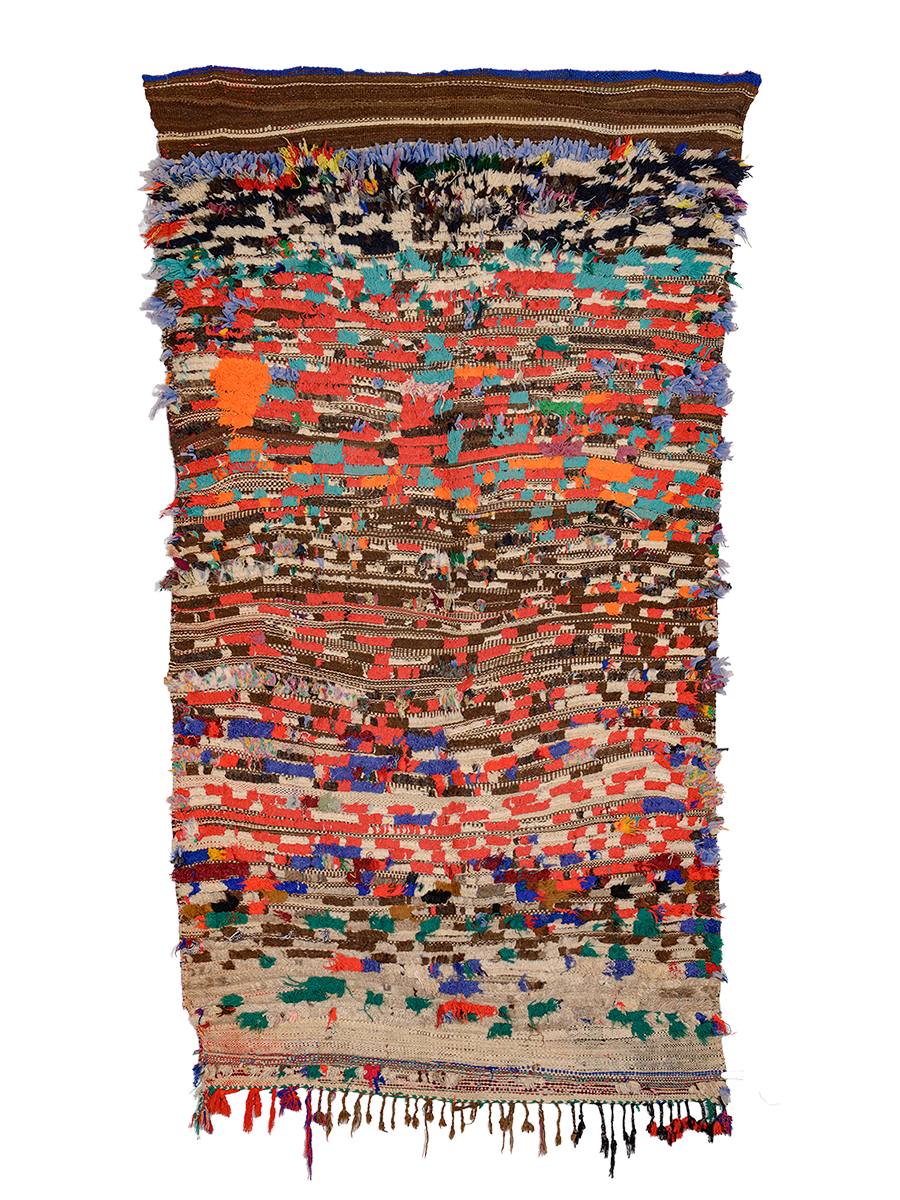
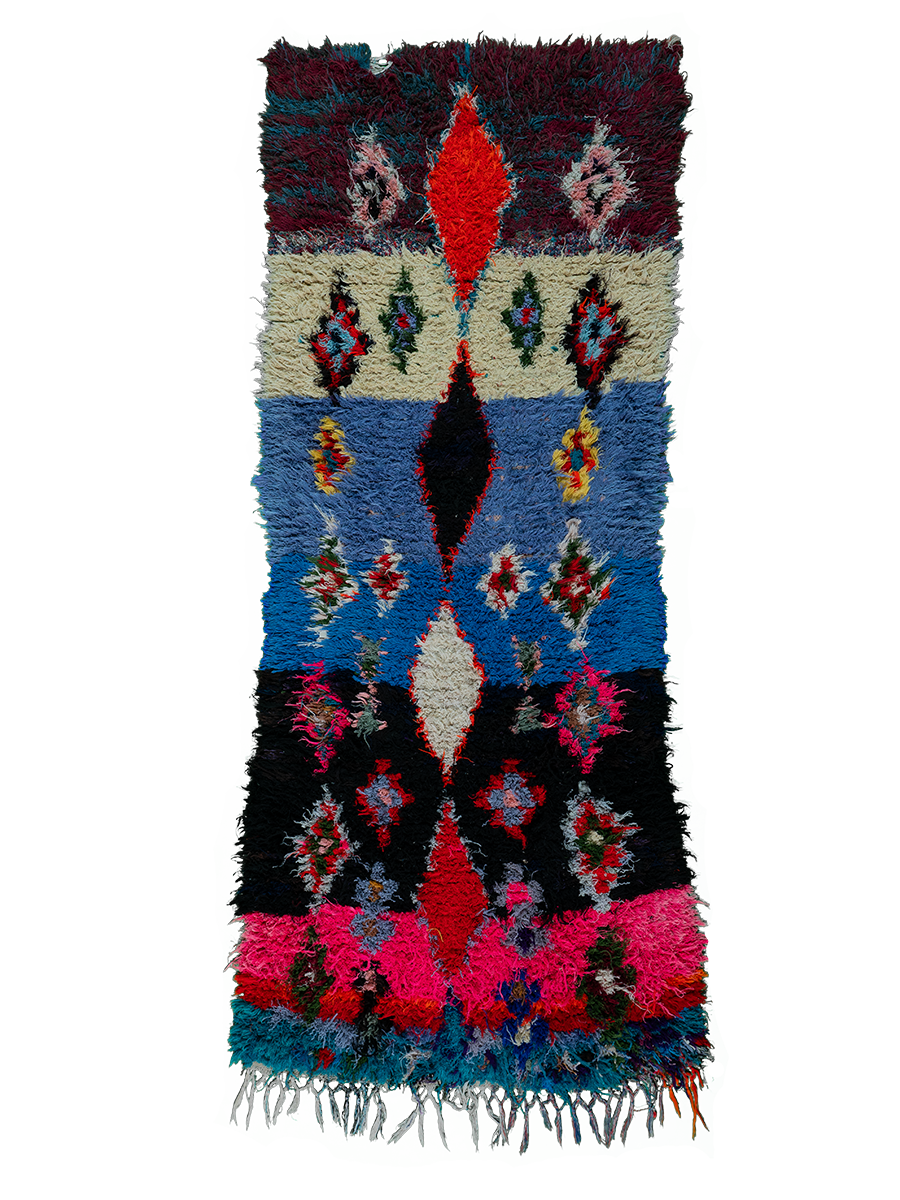
Once you’re ready to bring color inside, start small but impactful. Paint is my number-one suggestion because it’s relatively inexpensive and transformative, even in small doses. Beyond that, swap in bedding, artwork, or—my personal favorite—rugs.
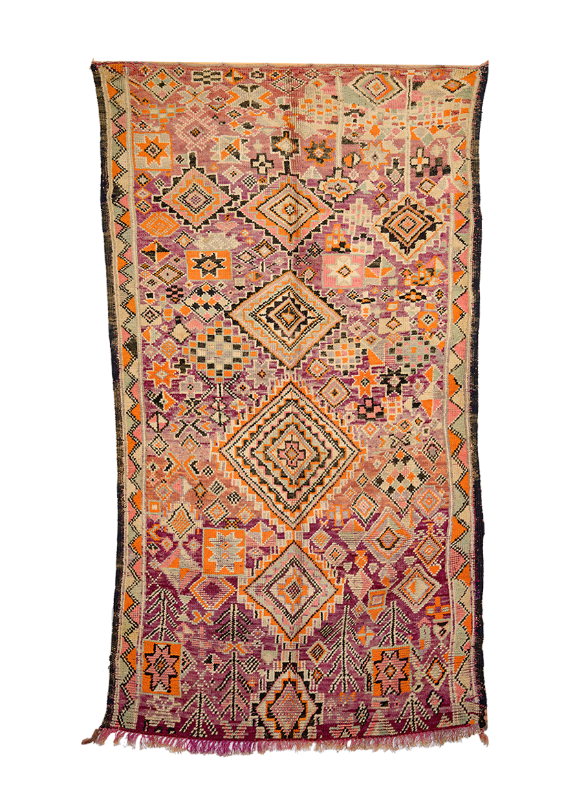
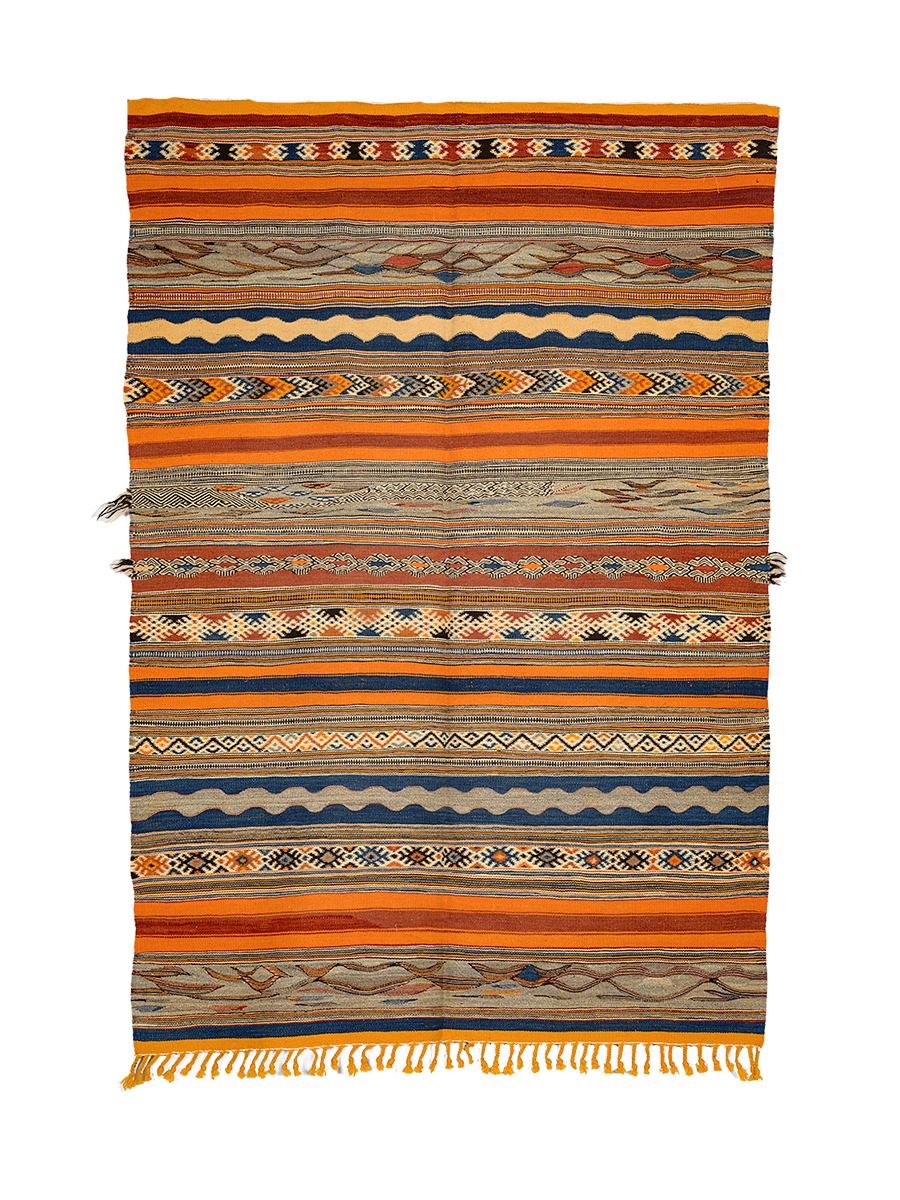
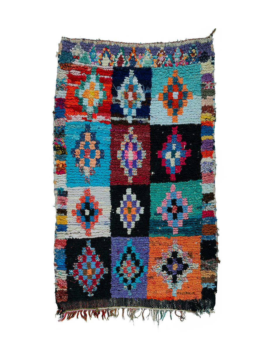
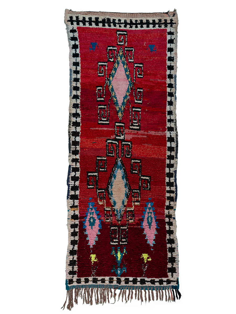
Why are rugs a great jumping-off point for introducing color?
Rugs are the anchor of a room. They’re large enough to make a statement but flexible enough to swap out down the line if your taste shifts. Unlike a sofa, which often defaults to a safe neutral, a rug gives you room to play with bolder shades, fun patterns, or a single accent color that can ripple out into the rest of the space.
I always tell clients to start with a jumping-off point—something that sets the tone for everything else. Rugs are perfect for this because they naturally tie together multiple colors. You can pull wall paint, decor, or artwork cues directly from them.
What are the most common mistakes people make when decorating with color?
A big misconception is thinking that a color you loved online will look identical in your home. It won’t—color changes dramatically depending on the light in your space, the finishes of your furniture, and even the direction your windows face. That’s why testing swatches is so important.
Another common mistake is being too timid. Playing it overly safe often leads to a space that feels flat rather than alive.
How do you keep color playful but cohesive?
It’s all about balance—and balance looks different for everyone. Some people feel best when every room has a strong through-line, while others love when each space feels like its own little world. There’s no single “right” way.
In my own home, I carry a few colors through different rooms to create a sense of flow but still let myself play. For example, my kitchen backsplash features four bright colors: yellow, pink, red, and green ochre. Because of our open floor plan, I made sure those shades appear elsewhere in the house—sometimes boldly, sometimes more muted. I also added blue as a wildcard. It’s kind of a rainbow, but because I repeated certain colors, it feels cohesive.
The key is finding your version of balance—whether that’s repeating one accent shade throughout, experimenting with different tones of the same color family, or letting each room have its own personality with just a few subtle threads tying them together.
Where can we follow you for more tips?
Subscribe to my newsletter, Statement Wall, on Substack! I share tips for decorating with color, creative exercises, and stories from my own projects. You can also book a Color Call with me through my website if you want help choosing paint or breaking down a design dilemma. And of course, I’m always sharing updates on Instagram at @danielacaraya.
Photographed by Olivia Nadel.